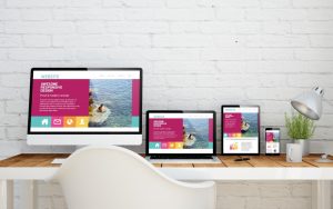
Everything is all about the digital platform these days. Companies, big or small, have all taken their businesses to the interwebs as more people are subscribing to digital media.
These companies, however, are competing against each other for digital dominance — which site has better content, graphics, cloud data backup, and so on. In most cases, businesses invest a lot on the aesthetic aspect of a website because this is what catches people’s attention. As the year comes to a close, let’s take a look at the direction web design is headed towards in 2020.
Oversized Lettering
Oversized lettering or bold typography is increasing in popularity these days as more website owners are looking to simplify their web design. There is an emerging slew of bolder typefaces coming out. Simplifying the look allows the user to enjoy the site with fewer distractions and navigational confusion.
Simplicity has been one of the top design trends for e-commerce in recent years. Sometimes, a single word’s message can be louder than a picture with a thousand words. For times like these, huge typefaces make plenty of sense. Couple that with a bold colored background will make your message stand out all the more.
Asymmetric Layouts
Playing it safe is no longer safe nowadays. Think about it. Most website designs work around grids that maintain orderliness. A website owner who wants to break away from the usual blandness should consider the broken grid approach of asymmetrical layouts. This communicates uniqueness, fun, and creativity to their market which will make them stand out. Dada Data employs this technique very well.

Split Content
For those who prefer to keep their sites organized, the split content approach can be used to create a fun and creative site but still maintain orderliness. You can use it to showcase several elements and messages on a single page while keeping it clutter-free. Talk about hitting two birds with one stone! Hello Monday’s website successfully pulled off the split-screen layout.
Voice Interface
The voice user or voice capability interface, while not a design element, is a direction several developers are looking at. This feature allows a user to interact with the website through voice prompts. It adds accessibility, functionality, and usability to your platform. It is more convenient for people to speak into the device than enter their text manually. It is also quite helpful for people with certain disabilities.
Hidden Navigation
With the emphasis on minimalism for the year 2020, this method works best at keeping your interface and platform simple and clutter-free. It saves you a lot of space and gives your site a clearer and cleaner vibe. Masi Tupungato’s website, for example, lets you access the menu when you click on the top left corner icon.
These are just some of the cool designs predicted for 2020. You still have plenty of time to start making plans to update your websites. If the trends for the past few months are any indication of things to come, we’re in for a visually stunning 2020.

